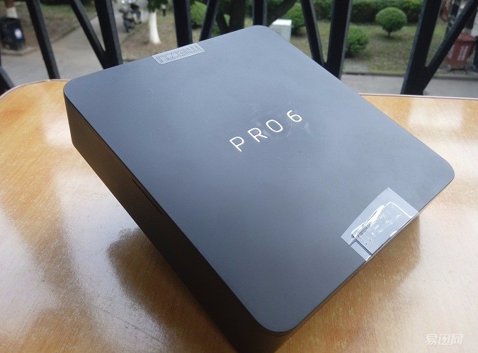
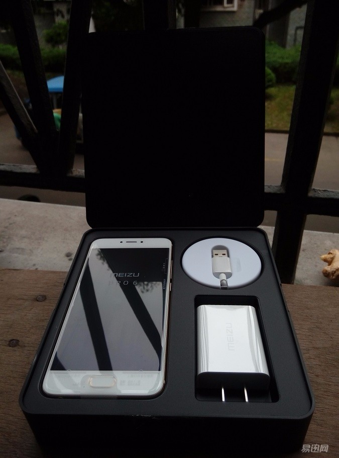
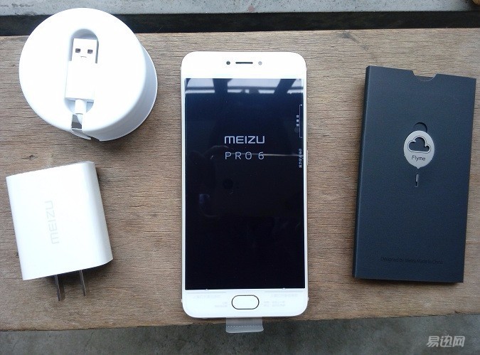
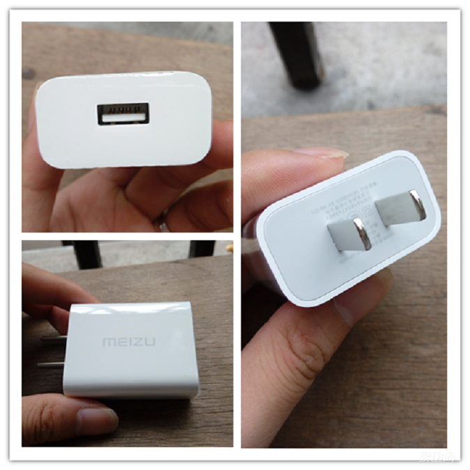
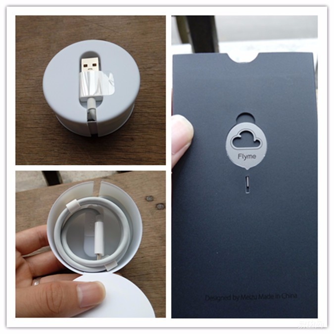
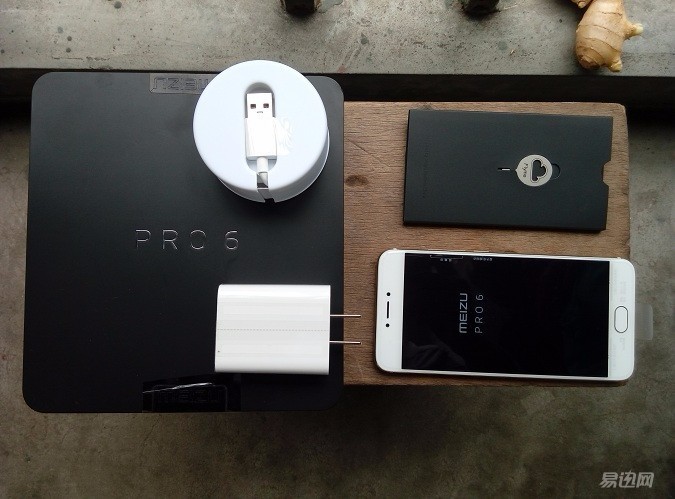
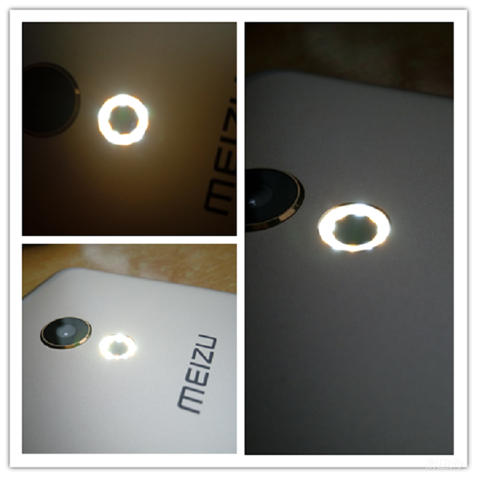
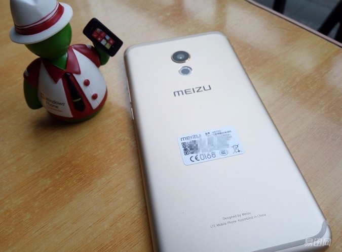
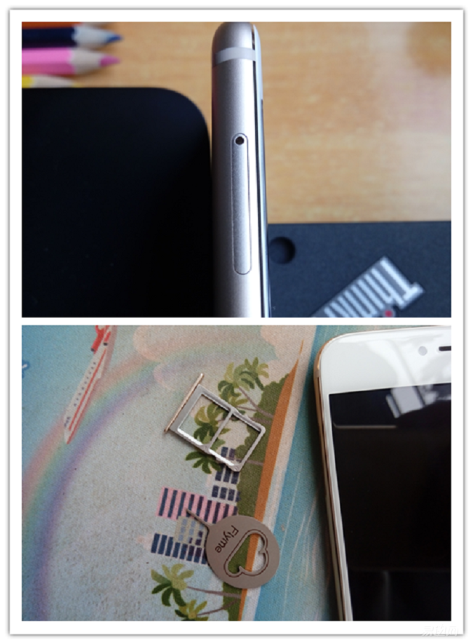
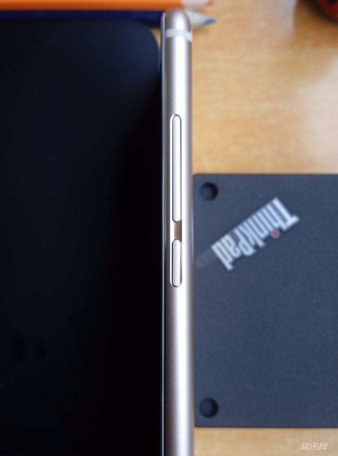
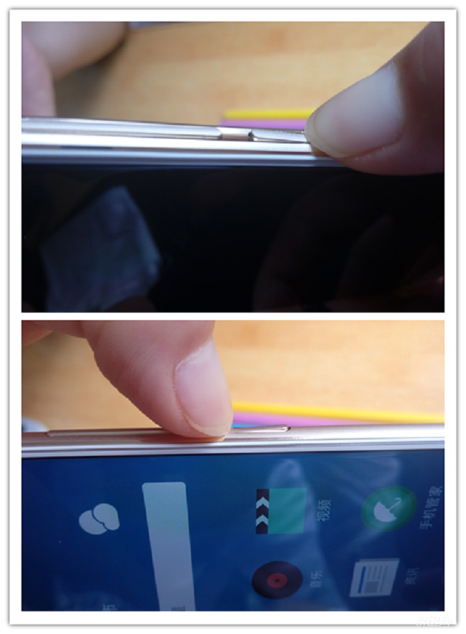
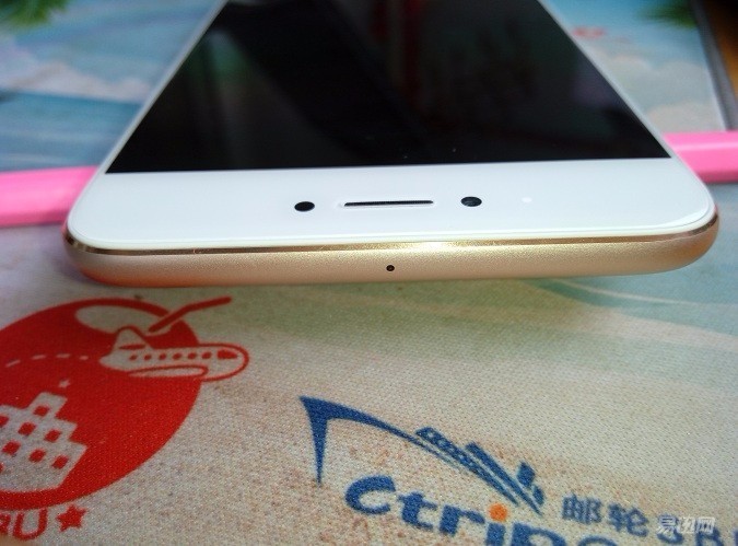
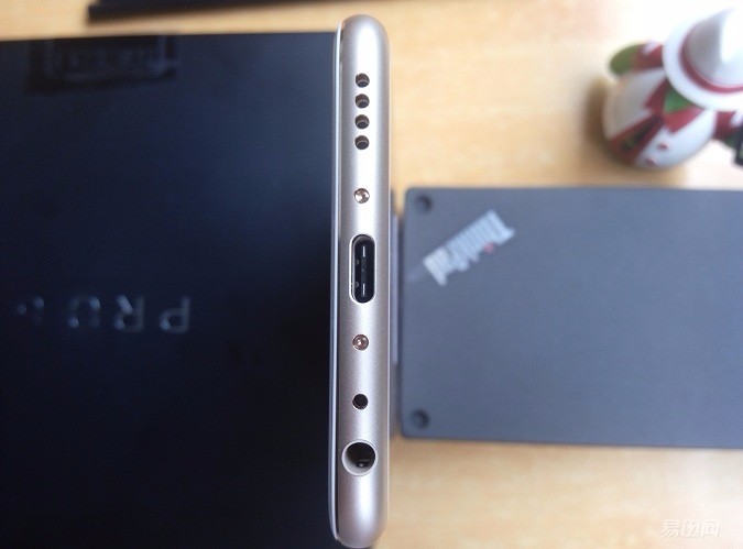
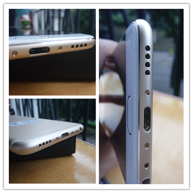
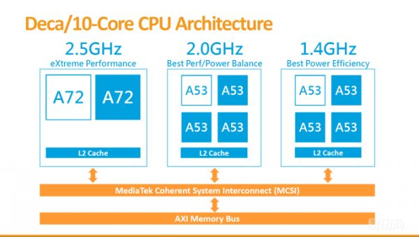
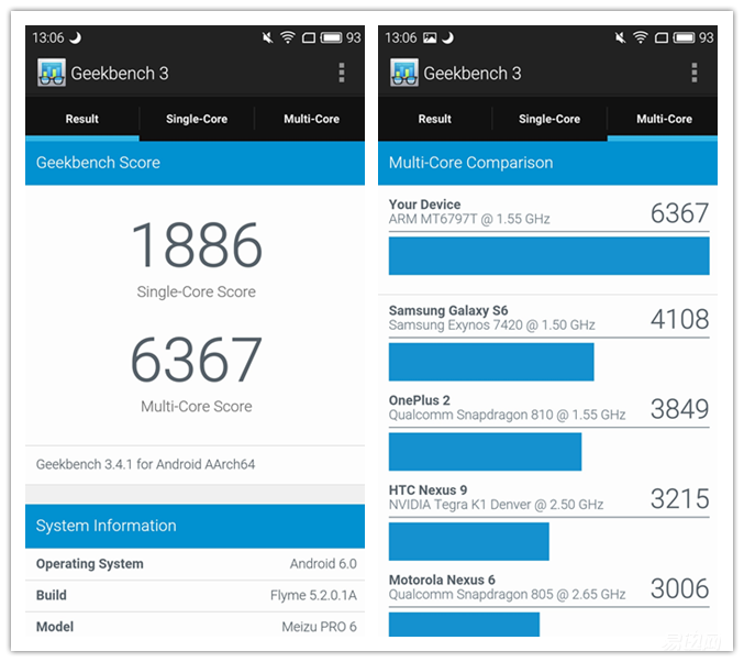
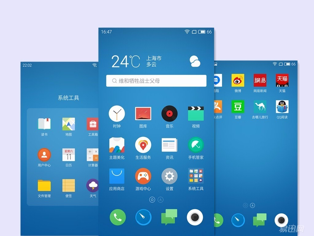
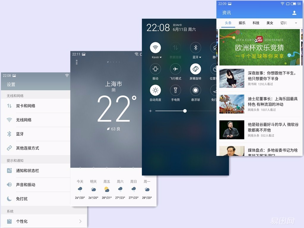
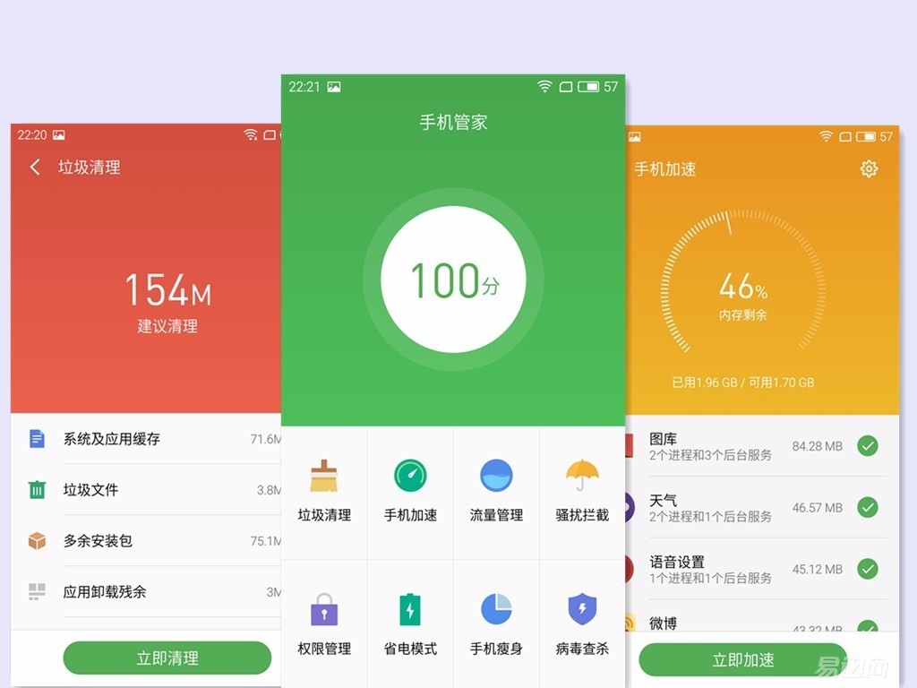
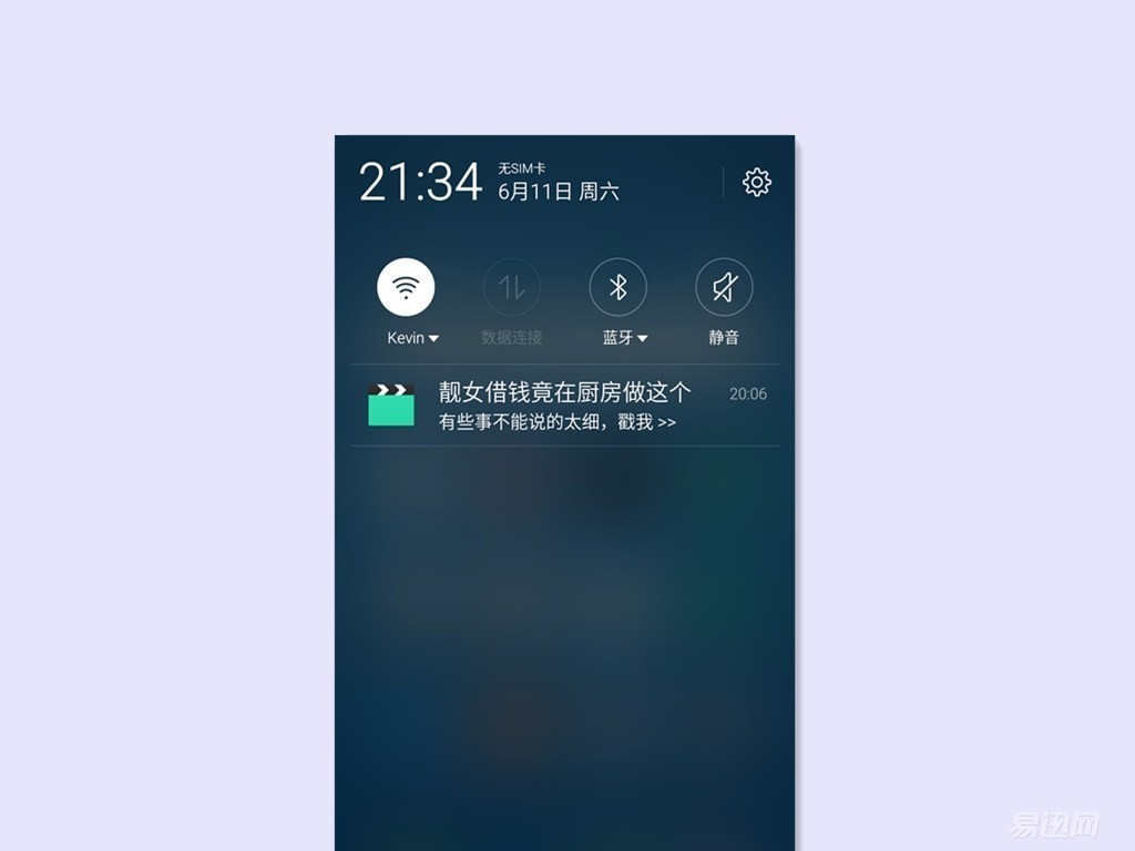
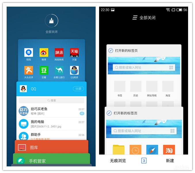
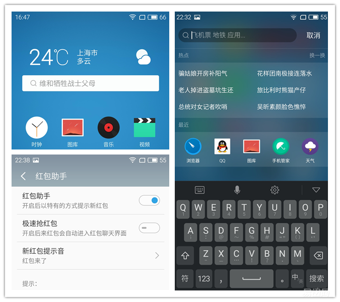
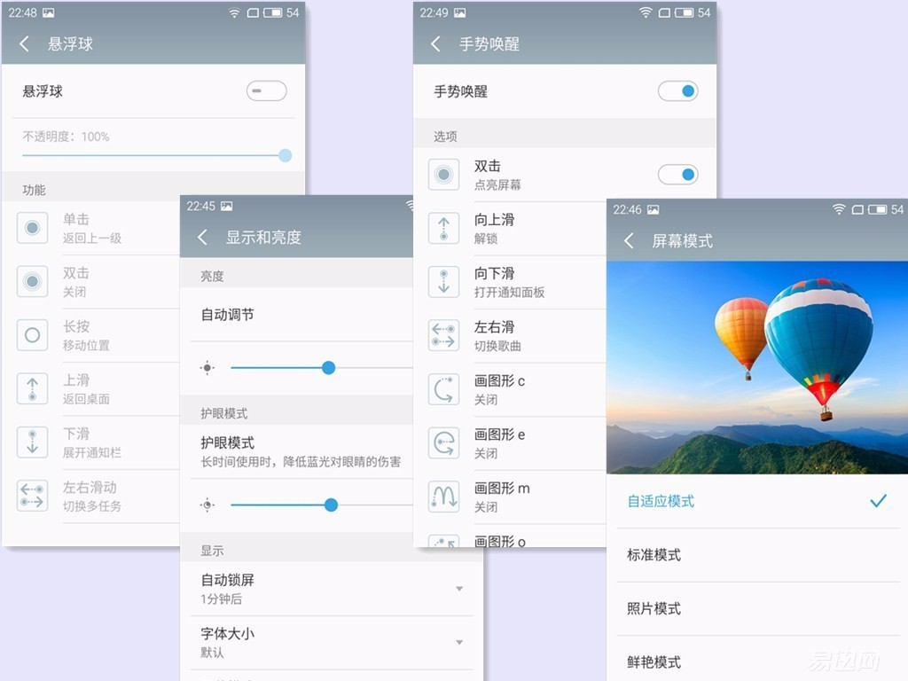
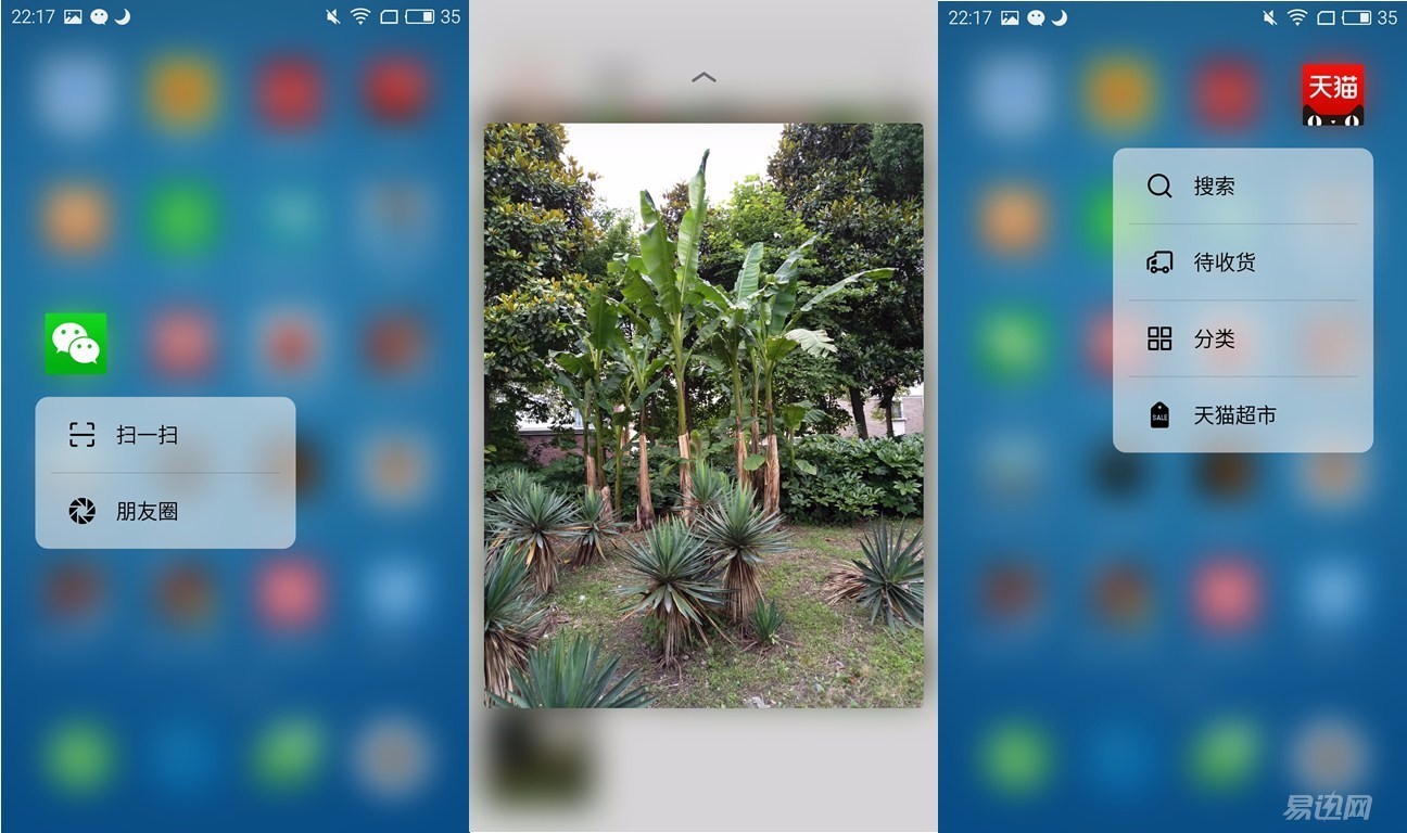
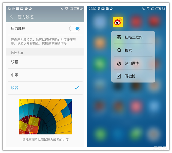
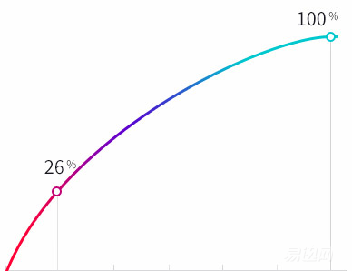
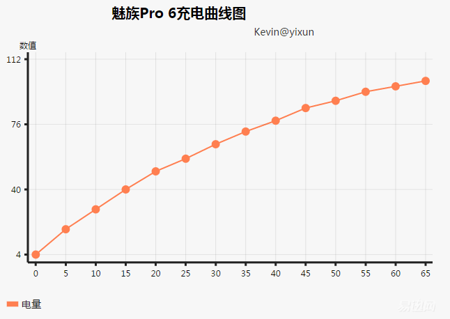
First of all, I am very grateful to the discovery of the king to give me this opportunity to participate in the Meizu PRO 6's public test. Before Xiaomi appeared, Meizu had been Apple's first disciple in China and had once copied Apple's model across the board. In more than ten years ago, Meizu was an MP3 & MP4 manufacturer. After launching the first MP3 in 2002, it quickly occupied the domestic market. After the dominance of the MP3 market, it announced the development of mobile phones in 2007, and finally in 2009. The first mobile phone M8 was released on February 18. From this brief development trajectory, how similar is Apple. Apple also started out with music players, and after its maturity it launched an iPhone that redefines cell phones. And at the time, Meizu is also a step toward Apple, Apple introduced the first iPod in 2001, Meizu launched the first MP3 in 2002; Apple released the iPhone in 2007, Meizu also announced in 2007 to enter the mobile phone industry. A deeper analysis will find that early Meizu had a lot of Apple's shadow. 1. Small and refined product strategy    It is known that almost all of Apple's product lines are small and refined. Although after Apple’s death, Apple is increasingly unable to hold back the expansion of product lines, so far, the iPhone still has only two mainstream models (se and 5c). It may not be anymore.) Meizu also inherited the tradition of Apple. In the era of MP3, only ten products were introduced. However, each of them is a finely crafted product, and it also created a very good reputation for Meizu. In the era of mobile phones, the early stage of Meizu's push of new products was slower. M9 was launched only two years after the launch of the first mobile phone M8, and the middle experienced multiple bounce tickets, probably because the Meizu R&D capability was weak at that time and the final product was not. In line with the fine line. 2. To create the most demanding image of the founder of the company, Joe is a symbol of Apple. With his extraordinary vision and the pursuit of perfect character, he has created a series of God’s general products, and Meizu has also built its founder, Huang Zhang. Become a character and pursuit of similar characters. Before Huang Huang, he used J. Wong's nickname to communicate with users on Meizu's forum. He also likes to chat with users from time to time. He is very paranoid about what he seeks to identify, and even he does not hesitate to overturn. I do not know is the nature of this or deliberately publicity, Huang Zhang these characters and Steve Jobs are very similar, and such personal distinctive features are also early Meizu propaganda are very good. 3. Hunger Marketing    The hungry marketing of mobile phones should be regarded as invented by Apple. Every time Apple launches a new machine, many fans will line up long before the store. The same is true of the early Meizu, especially when the M9 was released, the team in front of Meizu store was no less than Apple's battle. Of course, hunger marketing was later carried forward by Xiaomi, so I will not go into details here. In recent years, due to the impact of the millet model, Meizu can not be alone, with the return of Huang Zhang and Ali's entry, Meizu expanded the product line, there are currently positioning the flagship Pro, targeting the high-end MX series and thousands of machine brand charm blue . This time we have to evaluate is Meizu's latest flagship model Pro 6. It was found that the parcel was tightly packed and the machine was well protected. After being disassembled, it was still stunning by the Pro 6 box. Unlike most paper-based mobile phone packaging, Pro 6 uses a resin material that is not only harder than paper but also has a matte finish. With the appearance of the square and the logo of the metal texture, this package meets the taste of the flagship model. The seal underneath should have been found to have been opened for inspection, so it was cut open with a small blade, and the true face of Pro 6 was unveiled. The golden machine received this time, the accessories are relatively simple, there is a power adapter, data cable, card pin and instructions. In fact, there is still a headset slot below the phone, but this does not come standard with a headset, just started to see the headset logo on the earphone slot, but also thought that there are benefits, carefully look only to find that is not included, empty joy. Pro 6 supports QC3.0 MTK PEP 2.0 and dual two kinds of fast-charging techniques, so the power adapter is larger than the average, and supports 5V / 8V-3A or 12V-2A output. The data cable is the USB TYPE-C interface. The packaging is also very particular. It uses a special prototype box and has two clips. Also due to fast charging technology, this self-contained data line is very robust. In addition, I like the Meizu card pin design, just Flyme's logo design, very recognition. Well, finally come home. From the perspective of packaging on the high-end atmosphere alone, Pro 6 meets the high-end flagship positioning. In this era of mobile phone spelling configuration, a mobile phone can be quantified as a parameter configuration table, the appearance seems to have been less important, but never underestimate the consumer's beauty. In the era of non-intelligence, OPPO swept the entire girl market with a candy keyboard, and now it looks comfortable and is an indispensable factor in choosing a mobile phone. Therefore, our formal evaluation began with the design, to slowly solve this Meizu Pro 6. The phone's greatest experience is the roundness, the same rectangular rounded corners as the Pro 5, the home button on the waist, the seamless combination of the 2.5D glass and the sleek frame, and the curved antenna slot shows the design. Uniform and refined. First of all, the front face of the light sensor, the front camera and the earpiece do a complete symmetrical design, with the white panel is indeed a little white sense. Do not underestimate this symmetry design. This is related to the opening of the screen glass and the internal design process. It is not simply moving the position so simple. This is also the reason that there are not many symmetrical mobile phones on the market. The handset has also been changed to a mesh design, and the opening is very narrow, reducing the phone's dust and making it easier to clean. Meizu's mBack waist key design has always been my favorite Home key solution in the Android camp. This mBack solution was also developed by Meizu after many explorations. It was used for the first time on the Charm Blue note2, and integrated touch. Return, press home, and fingerprint recognition. Pro 6's home button feel is not as good as I thought, although the key process is appropriate, the feedback is also very good, but it feels a little crisp, press the half-empty feeling. In addition, I do not know whether it is the reason for the ultra-thin body, home button is made flat, and charm blue 2 concave Home key comparison, concave down a bit in fact feel better. mBack's Home key design has a sticky experience, and now it's totally unnecessary to use the traditional Android three-button design. Compared to the front, the back side has a larger change. The first is the slotted design of the antenna. The fuselage antenna design of Pro 5 and the spray paint it brings will inevitably lead to the color difference between the upper and lower two pieces and the theme part. At the same time, the feel difference of the aluminum alloy in the spray paint part can also be obviously felt. The slotted dividing line of this antenna changes from a straight line to an arc, which also fits perfectly with the rounded design of the Pro 6 itself. It is no longer a conflicting factor, making the back style more uniform. In addition to antenna slots, the most prominent design on the back is the combination of a camera and flash. They are big and small, they look very sophisticated, and this round flash design is also very eye-catching. First look at this camera, in the overall 7.25mm thickness of the case, the camera slightly protruding body, has been considered very thin, but to remove the optical image stabilization, this is a pity. In addition, we look at the design eye-catching flash that comparison, the middle portion of the black laser focus module is surrounded by a ten small LED flash, a closer look at the surface of the globe Fresnel lines, such a design allows The light is softer and the LED patch inside looks like a circle of colored diamonds, which is very delicate and beautiful. The official said that this circular flash design will bring more uniform and soft fill light effect, in fact, compared to the shooting of the object, the flash of this circle is almost the same point light source, unless there is a role in certain macro , but the phone's macro is not very good, there will be instructions later. Since there is no better effect on the fill light, then for the sake of designing a round shape, my guess is for laser focusing. The official said that Pro 6's laser focusing module can reach a focal distance of up to 2 meters, which is 4 times that of Pro 5. Longer focusing distances certainly bring larger modules. If you still use the Pro 5 flash design, the length of the flash and the length of the laser docking module will be very ugly. So simply designing a circle not only fits the overall sleek design language, but also increases the recognition of the machine. On the back there is a bizarre question, Meizu directly attached to the back of the serial number stickers, and it is not easy to tear off, visual inspection can only be opened by blowing hot hair slowly, it is like a dog skin plaster paste in a Full of sense of design on the wall. Pro 6 started with 32G storage, so it also directly canceled the support for SD card design. Both card slots only support Nano-SIM card. At the same time, the point to be commended is that the color of the magnesium alloy of this card slot and frame is very similar, and there is no sense of abruptness. After opening the card slot there was no shaking phenomenon on the Meizu products before, the overall work is still quite good. The other side is the power button + volume button, Pro 6 in the side specifically opened a slot to increase the key process of these three buttons, the concave part of the highlight processing, appears more refined. Like the Home button, the key's key feel is not particularly good, and it's a little brittle, unlike the iPhone button's richness. In addition, the keys are relatively swaying, and since the power key is relatively long, it is useless to hold down the corner and must be pressed as a whole. Because the earphone hole is designed at the bottom, the top is very concise. There is only one noise reduction microphone. The design is in the middle. The designer may want to maintain symmetry as much as possible, but I personally feel that a hole is always in the middle. weird. . . Relative to the top, the bottom of the thing is a lot, including the charging port, microphone, speaker and headphone hole, and two fixed screws. Although there are many things, this layout should be carefully arranged and the visual effects are good. Compared with Pro 5, another important design is that each of the speakers, microphone, and charging port has a 0.2mm high-light chamfer at each opening. This will not only improve the grade, but also improve the grade. There will be no hand scraping. The reason why this can be done is exactly the one-size-fits-all antenna slotting. Since the Pro 5 is not a one-knife antenna slot, the upper and lower parts are sprayed with paint, and the surface of the paint cannot be treated with such high-light trimming. In the end, I would like to mention something that is nothing more than that - touch. Using Pro 6 These days, the place I feel most comfortable with is the feel. First, it should be related to the size of Pro 6. Pro 6's screen is 5.2 inches, with ultra-narrow frame, the overall size is only 147.7 70.8mm, be careful in the 6-inch flagship on the machine is relatively small, and small screen will inevitably bring a sense of improvement. On the other hand, 5.2 inches is also fully adequate for mobile phones, usually brush microblogging, on the WeChat, look at the web is enough, the experience will not be worse than the 6-inch mobile phone, so I hope more and more in the flagship machine screen Big today, manufacturers still consider the user's feelings, more about 5-inch machine. The other reason for the good feel is that the curvature of the frame is very good, 2.5D glass not only brings a visual increase, and the curvature of the glass can be perfectly combined with the metal part of the frame, forming a very natural transition, not to mention grip Holding, even if it is stroked back and forth, but also almost no sense of convergence is not smooth. In terms of the appearance and design of the entire mobile phone, except for a few buttons, the hand feel is slightly lacking, but almost no shortcomings can be found. At the same time, a sleek design language, exquisite workmanship and innovative antenna slot and flash group, domestic machine first Should be well deserved. At present, we are forgetting to forget the parameters, but the parameters are a quantified indicator of the mobile phone, which can intuitively reflect the performance of the mobile phone. What we need to do is not be fully parameterized. After all, performance is sufficient, and the experience of using the mobile phone is the most important. . First we look at the most controversial part of Pro 6's configuration : the MTK Helio X25. Meizu has always been more interested in MediaTek. Before the launch of the Pro series, MediaTek’s chips have been used on its flagship MX series, and MediaTek has sold its high-end processors to Xiaomi as a low-end model for shipments. Chips, Meizu deeply suffer from it. So this time when Pro 6 re-use Mediatek's chips, MediaTek gave Meizu an exclusive period of several months, while Meizu also threatened that if MediaTek resold Xiaomi as a low-end device, then Meizu’s flagship will switch to Qualcomm. However, within a few days, MediaTek X25 changed hands and sold it to LeTV 1499 as the music as 2 Pro, huh, huh. . . As the so-called "Qualcomm frequency, MTK core", MediaTek's X25 is the world's first ten-core mobile phone processor (X20 and its genus homology, as a product), and claims to be both in heat and power consumption Leading to Qualcomm 820. Let's first look at how these ten cores are allocated. The above figure shows the X25 architecture. Ten cores are divided into three parts. The first part is four 1.4G A53 cores that are used to handle low-load tasks such as desktop slides and UI operations. Part 2 Are four 2.0G A53 cores, used to handle medium performance tasks, such as viewing photos, playing music videos and other tasks; the third part is two 2.5G A72 large cores, used to handle high-performance tasks, such as open Applications, large games, etc. Although running points can not represent everything, we can look at the theoretical performance of this processor by running points: According to GeekBench 3's test data, the theoretical performance of this processor is still very strong, with a single-core performance of 1886. Although this figure still has a certain gap with Xiaolong 820's score of 2,000 points, it is a unicorn of Huawei. The 950 should also have a slight advantage. In addition, due to the accumulation of core numbers, multi-core performance is the second kill Xiaolong 820, and Qilin 950 is not much difference. The design of three clusters and ten cores can meet the requirements in different scenarios. Theoretically, it is a relatively perfect design. However, the actual situation will be mentioned in the subsequent tests. GPU side, X25 uses the highest 850mHz the Mali-T880, camera support up to 25 million pixels (if it is dual cameras supports 13 million +1300 Wan), 2K and 4K video recording screen. If the GPU and the Qualcomm 820's AdrenoTM 530 GPU are about 20% worse, the basic experience will not be much felt, but when playing large-scale 3D games, Qualcomm 820 will be more smooth. At the same time, pay attention to the temperature at the time of running the minute in the above table, the maximum has reached 41 °C, the overall feeling has been very hot. The 1038 total score is also thrown off by many models: Due to the X25's limitations, Pro 6's storage system lags behind the entire era. Memory cannot be used on LPDDR4 3200, and only LPDDR3 1866 can be used. Flash memory also uses eMMC 5.1 because it does not support UFS interfaces. However, in the current performance system, the difference in this aspect has very little experience. Now, please come on top of the famous security Bunny Run sub-software, Pro 6 reached close to 100,000 points, although less than Xiaomi 5 and so on more than 100,000 running points, but in the case of not playing large-scale 3D games, such scores have been able to Enough to ensure the experience. I try to play the next NBA 2K16, the game frame is basically 10 frames up and down, almost can not play. During use, I discovered that, except when using test software to run points, in other cases the two A72 big cores have never been run, and most of the time even when running large 3D games such as NBA 2K16 and Need for Speed. The use of the four A53's small cores is obviously a bit out of place, but how can we get it to run the A72's big core? We have to ask the Da Shen An Bunny. After the security bun was opened, the hospital was summoned to the big core of the A72. After keeping the security bunny in the background, we again ran the NBA 2K16. At this time, we found that the game quality was improved a lot and the number of frames increased to about 30 frames. In addition, there has been a significant increase in the speed of the App's opening, indicating that the performance of the two A72's big core is sufficient, but it is always open. Summarizing, the performance of this MTK X25 is actually very strong, especially in the multi-core performance, but due to the cause of heat and life, but also had to long-term vacant two A72 big core, resulting in the actual use of far performance Far less than theoretical performance. This is a bit like last year's Snapdragon 810, which has strong performance, but has been down-converted due to poor power control. Therefore, the overall performance of the X25 is still smaller than the Snapdragon 820, which is the only regret on the Pro 6. First we take a look at the Pro 6 camera parameters More than 21 million pixel cameras are outstanding in the details of the reservation, a circle in the community to see how Pro 6 photos quality. The resolution during the day is still very good, the details of the picture are kept in place, leaving a lot of space for the post-processing, but each photo is close to the size of 10M, 32G is not necessarily enough. . In the shooting process, the metering accuracy is good when the outdoor light is sufficient, and the focusing speed is also very fast. However, since there is no optical image stabilization function, the film formation rate is not high, and it is easy to cause a blur due to hand shake. Another feature is that the photos taken are very saturated, and the photos are very vivid. Although they are strategies to please the eyeballs, they seem to be overly unrealistic. I prefer to take macro photos, Pro 6 also happens to have macro mode, but always unable to focus when the distance is close, I do not know whether it is my operation problem, or its own Pro 6 problem. In terms of imaging results, Pro 6 has reached the level of most domestic flagships in general, but there is still a certain gap between the perfect, mainly in the absence of optical image stabilization, focusing speed and color reproduction. We all know that Meizu's camera function has always been not very good, but this time, Pro 6 has been handed a qualified answer sheet, hoping that Meizu can further build on Pro 6 to create a better and more perfect camera experience. Pro 6 comes with a Flyme 5.2 system based on android 6.0. As MIUI joins a large number of advertisements and causes Xiaomi users to rebound, the Flyme system regains the trust of users with its refreshing and concise UI. Although Flyme once had the nickname of Bugme, it has become more and more perfect in the last year or two, and Meizu's actions are getting faster and faster. At present, Flyme should be regarded as the top ranked system in the domestic UI. When it comes to the Flyme system, you have to say that the Meizu design mBack operation, starting from the Meizu's first mobile phone, Meizu insisted on only one button design, and the Android system generally requires three buttons, so Meizu in the Home button design Has always been hard to think, such as the SmartBar design that was not used before. Meizu released Meizu blue note2 on the middle of last year. Meizu launched the mBack operation for the first time. Press the Home button to return to the desktop. Tap the Home button to return. Scroll from the bottom edge of the screen to the multitasking interface. In the model with fingerprint unlocking, the Home button will naturally integrate the fingerprint unlock function. The operating mode of mBack should be the best three-button solution on Android, which is both beautiful and at the same time practical. Now, seeing the three buttons below the other Android models will directly lower the value. At present, OPPO R9 has also adopted a waist circle button similar to Meizu, but there is no integrated return button. In addition to mBack, Flyme's biggest feature is simplicity. Relatively speaking, it is more restrained in advertising and pre-installed software, and pre-installed software also allows uninstallation. In the overall simple design language, Flyme's own software is also a unified design style, design should be considered superior, including the design of the drop-down notification center. What I particularly like is Flyme's Security Center, which integrates commonly used gadgets without installing third-party applications. Flyme is a bit obvious, but we still have to spit it out. The first one is the system's own software to automatically push messages, especially music, video, browsers, information and other applications, always pushed him to think that what I focus on is still not closed. You say that I will push this at night and ask me to do it. . . In addition, there are some small suggestions, such as the current interface design of the background task is not particularly good-looking, and the other close all buttons on the top, one-touch simply can not touch, the same browser multi-page. There are some features that you don't understand, such as a search box on the home page. From the friends around me, almost no one really uses this search feature. There is a desktop pull up to the global search function, this feature is rarely used, but also easier to misuse. The last is a deadly nausea feature - grab red packets, Flyme 5 or more seems to have automatically grab a red envelope function, and the default is open state, just get back that time a micro-letter red phone called "red envelopes come," sound Still dead, especially when the meeting is very awkward. Flyme system to increase the grab package features excited after the product team can understand, but it can not be so straightforward to open it directly, this function is not as a menu application, need to use it will naturally find the way to set. Finally, look at the Flyme's common settings. The Pro 6 uses an AMOLED screen. The screen display mode is added to the settings. There is also an eye protection mode, claiming that it can reduce the Blu-ray by 60%, but the yellow background is still a bit unaccustomed The other two commonly used functions are the gesture wake-up and suspension ball functions. After so many years of development, Flyme finally got rid of the shadow of Bugme. Now it has grown into a member of the first echelon of the domestic system. We hope Flyme cherishes the hard-won opportunity and does not prematurely commercialize it, giving the user a simple and refreshing experience. . Since the iPhone 6s added a pressure-sensitive screen, 3D Press is getting hotter (in fact, Huawei's mate S uses a pressure-sensitive screen earlier than Apple). Pressure touch is an extension of another dimension of common interactions, and will certainly assume more important responsibilities on mobile interactions. However, pressure touch is still far from popularization, and Android does not support pressure touch at the bottom, so the current pressure is only limited to the role of the application of the key. In touch strength, Pro 6 can be set to three levels, strongly recommended to be set to “weak†level, otherwise it always feels like you can bend your phone. In addition, unlike the iPhone 6s specifically equipped with a linear motor, the Pro 6 still uses a rotor motor, which cannot provide different vibration feelings depending on the strength, so the vibration feedback of the Pro 6's pressure-sensitive vibration feedback and ordinary touch of the Home button return vibration feedback is the same. Therefore, from the current point of view, pressure touch is actually a concept of gimmicks that are larger than actual ones. It is still necessary for the ecological maturity to play a greater role. Pro 6's battery capacity should be regarded as a special issue before purchase, after all, the capacity of 2560mAh in the current 3500 + flagship machine is very convincing. Meizu's design, whether it is due to the size of the screen, ultra-thin body and the limitations of the internal structure, have to say a little regret. The actual experience was not as bad as I had imagined. Moderate use of the whole day is not a problem. For users who are keen on the game or microblogging WeChat for the whole day, they may still have to carry the charging treasure with them. The Pro 6's charging interface has been replaced with the Type-C port. The biggest advantage is that both positive and negative can be plugged in. In addition, it also solves the problem that the previous generation of data interfaces often causes plugging and dropping of the interface performance. The only problem is that the Type-C data line is not particularly popular at the moment. Running around to the company and charging for electricity may require the entire department to be unavailable. Therefore, it is still necessary to prepare several data lines at ordinary times. In the course of life, Meizu is fast-charging. The Pro 6 is the use of so-called mCharge 3.0 fast charge technology, 10 minutes to charge 26% of the 1 hour basic full. In fact, the two points of this technology are not the charging speed, but the premise of guaranteeing the charging speed will not have much impact on the battery life. We all know that, in general, the faster the charge, the greater the damage to the battery, causing the battery may not reach the nominal number of charge and discharge. The mCharge 3.0 technology has three IC chips that continuously communicate with each other based on data such as body temperature, battery voltage, and usage scenarios, dynamically switching between high and low voltages to reduce damage to the battery. The following figure shows the Meizu official propaganda data. In the actual experience, Pro 6's charging speed is really fast. One hour is not an exaggeration. It takes a little time to record the charging time and power data. I started charging from 4% and it takes about 65 minutes to fill up. From the above figure, we can see that from 4% charge for 10 minutes there will be about 30 electricity, enough to deal with it for a while. The meaning of fast charging is actually not to fill a point in a short period of time. Instead, charging for more than ten minutes in a relatively urgent situation can result in hours of emergency battery life, such as finding out that the battery of the mobile phone is not enough when going out. With the change of clothes and shoes for 10 minutes, the mobile phone is charged to about 30% of the electricity, and it is easy to cope with emergency use for 3 hours. At present, under the Android system, it is very difficult for vendors to do differentiation. How to enhance the experience under the premise of sufficient hardware configuration should be the most important approach. Summarize the advantages and disadvantages of my use of Pro 6. advantage: 1. The high value of color, I believe most people will not have opinions. Meizu, as a former literary cleansing company, cannot review and design other domestic mobile phones. Regardless of whether it is a symmetric design, a one-size-fits-all and bent antenna slot is an ultra-narrow screen black border, and both are domestically-made top designs. 2. Feel good. Reduced size to 5.2 inches, ultra-thin metal body, the right combination of metal chamfer and 2.5D glass screen, personal feeling closer to Apple's level. 3. Flyme system is simple and clean, system interaction is also relatively stable, especially mBack interactive design is unparalleled, if Flyme can always maintain the current level is not mandatory commercialization, Flyme will become a major weapon of Meizu mobile phone. 5. 4G running memory ensures smooth daily use. 1. MediaTek's X25 processor has become a shortcoming that restricts the configuration. Due to the limitations of its own interface, it has caused storage and storage to lag behind one generation. In actual use, there is still a certain gap between the X25 processor and the Xiaolong 829. The large core with two A72s cannot be used normally. 2. Photographing experience is generally not regrettable without optical image stabilization, and it is not possible to focus on macros. In addition, the interactive design of the camera interface is not perfect. Many functions are integrated into the top of the screen and need to be pointed by another hand. 3. There are some small problems, but it still affects the experience, such as back stickers can not be torn off, such as the physical button feel is generally not very good, there is a problem is fingerprint unlock interactive design is not good, close the screen must be pressed The Home button is released and the hand cannot be unlocked without leaving the Home button. He has written nearly ten thousand characters, and still feels that there are still many experiences that he did not share. When he writes reviews, his mood is also more complicated. Pro 6 has many places where I can appeal to people. There are also many places that make me regrettable or even disappointed, but this is a Real product, it is not perfect. But from another perspective, there is no perfect product in the world, all aspects are relatively balanced, there is no obvious short board, and the mobile phone is the perfect mobile phone, so for me, Meizu Pro 6 is not perfect Perfect cell phone. Washing Machine Motor,Spin Motor Of Aluminium Wire,Washing Machine Motor Shaft,Automatic Washing Machine Spin Motor WUJIANG JINLONG ELECTRIC APPLIANCE CO., LTD , https://www.jinlongmotor.com

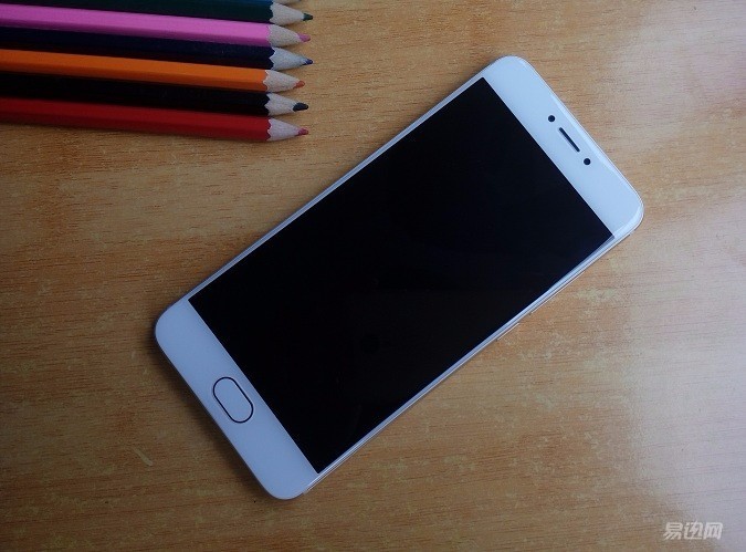



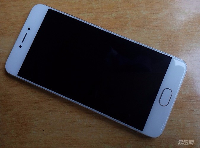
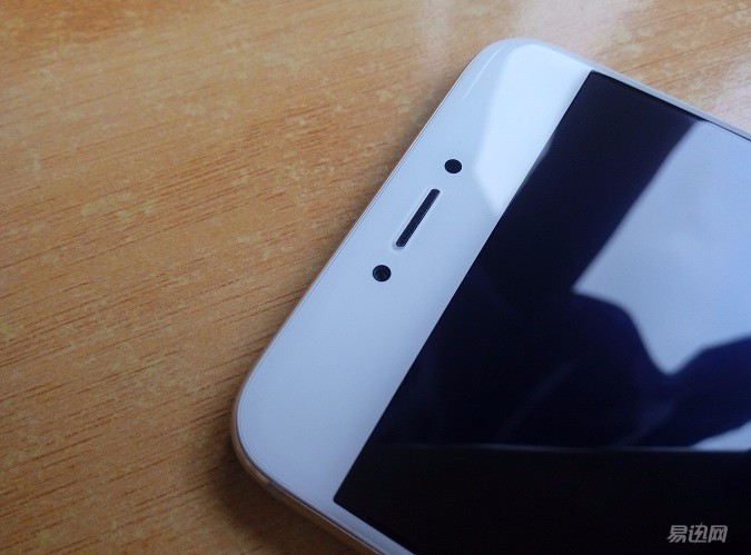
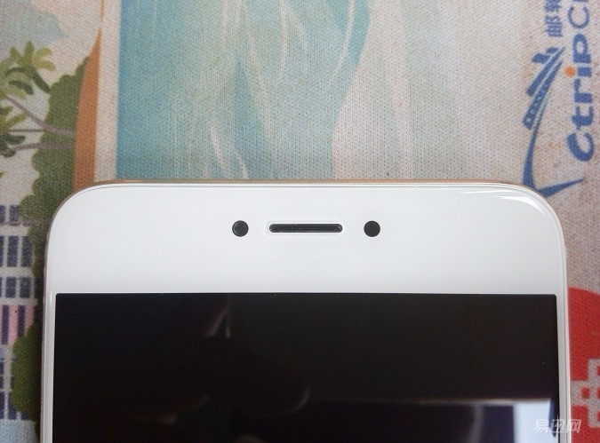
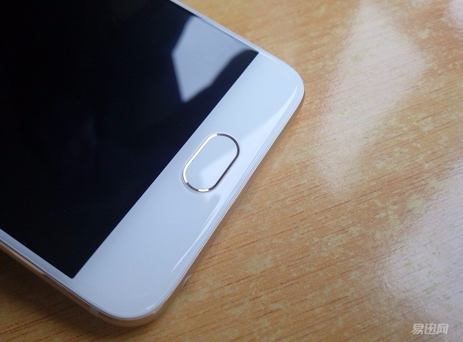
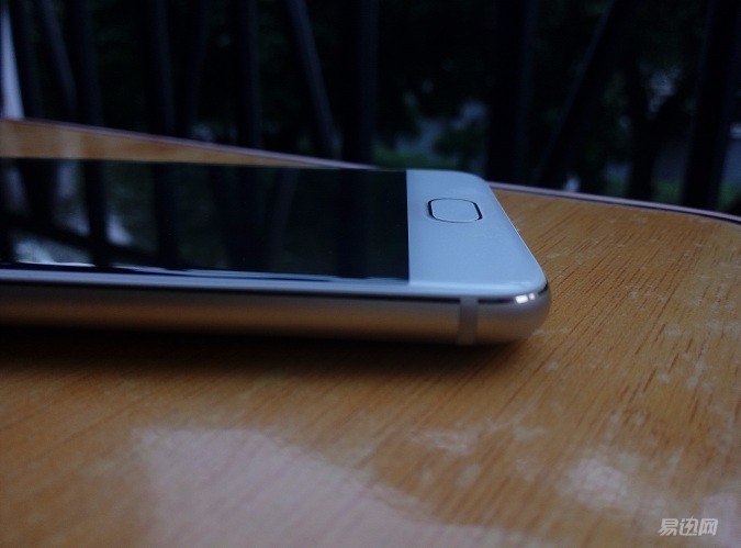
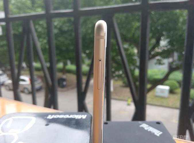
This time, the Pro 6 uses a one-off antenna design to ensure that there is no color difference in the area separated by the antenna slot, and because of its curved design, the area of ​​the upper and lower parts is minimized, and the back is integrated, improving the aesthetics. A grade. 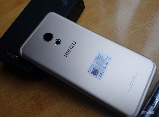
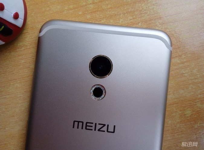
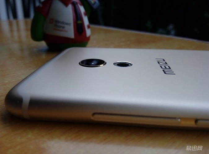
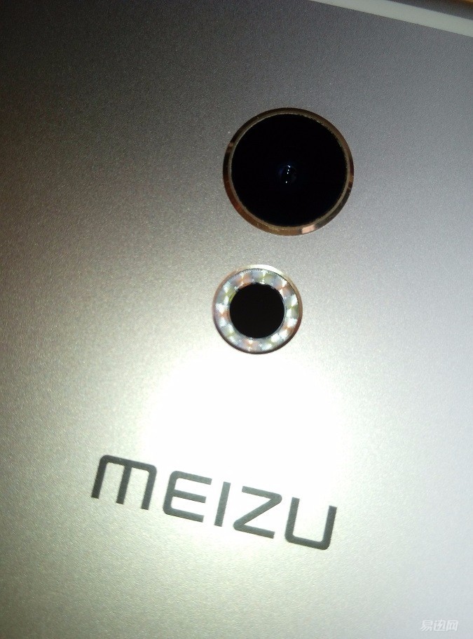

We use 3D Mark to test the GPU performance. From the running point of view, we can see that there is still a gap between this processor's graphics rendering and the Xiaolong 820's flagship. 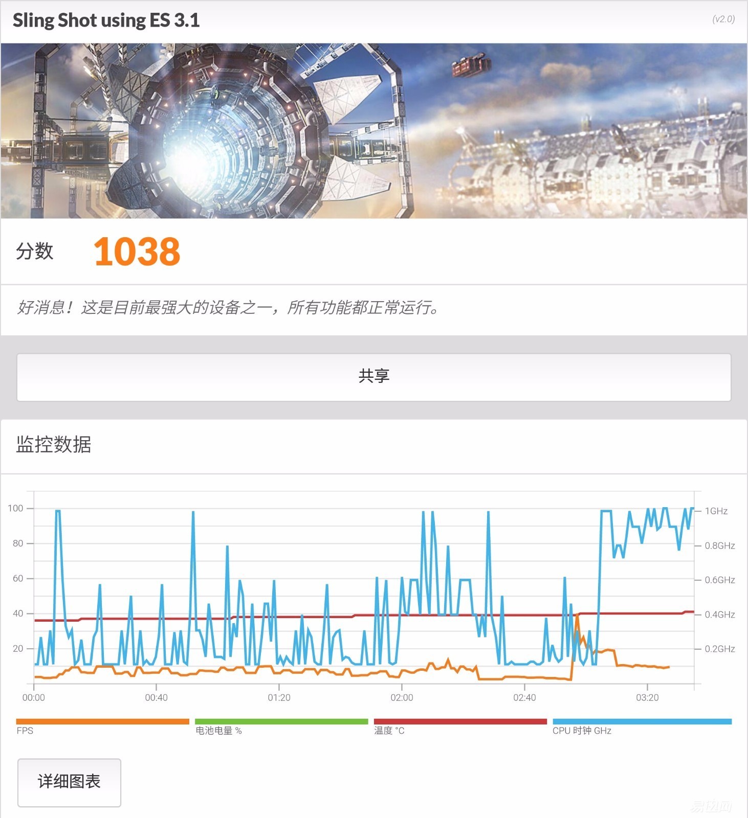
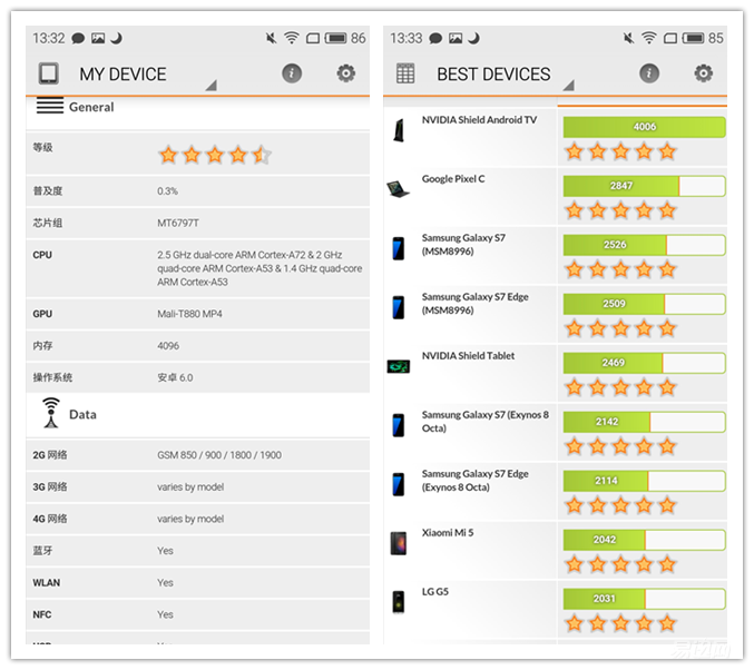
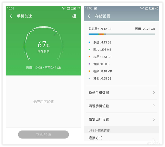
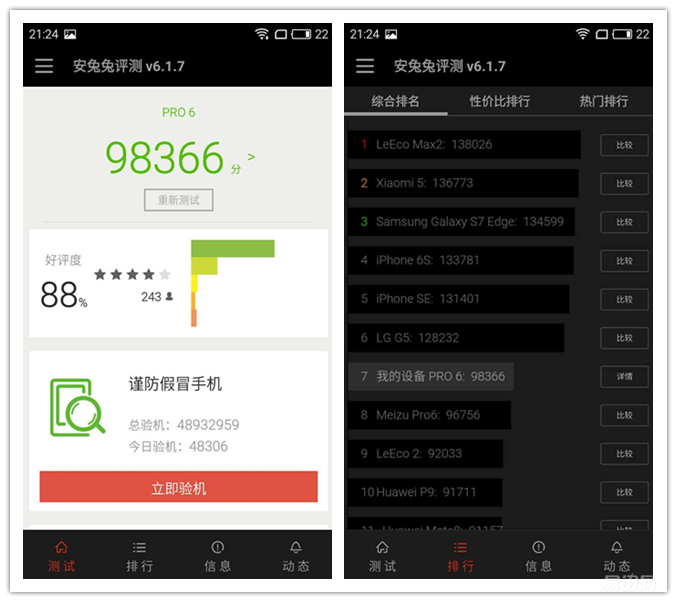
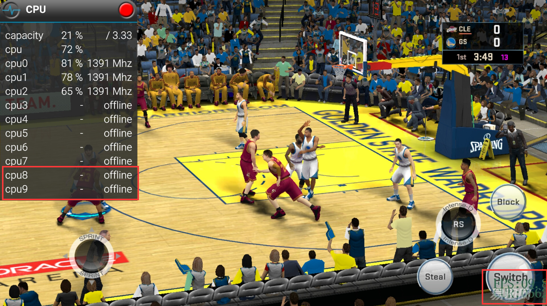
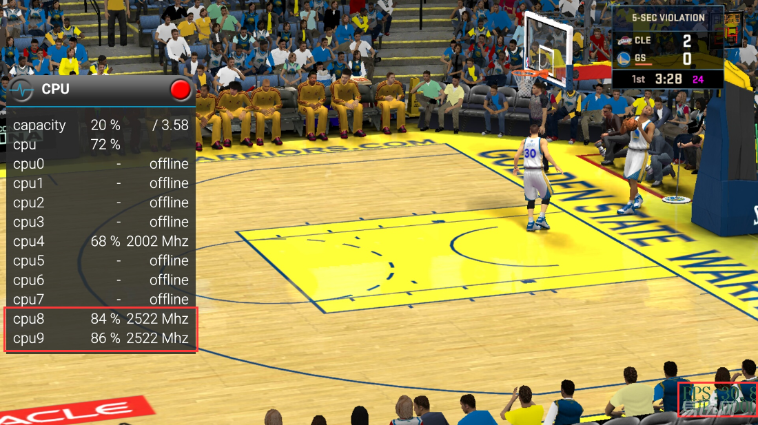
The reason is simple: heat dissipation. When the A72 large core was used for a long time, the back cover temperature soared. After about two or three minutes, the system automatically shut down the big core and changed it to a small core operation. At this time, the temperature had reached 48 degrees. Almost to the degree of hot. 







4. Fast charging technology is really fast, although the temperature is higher when charging.
Disadvantages: